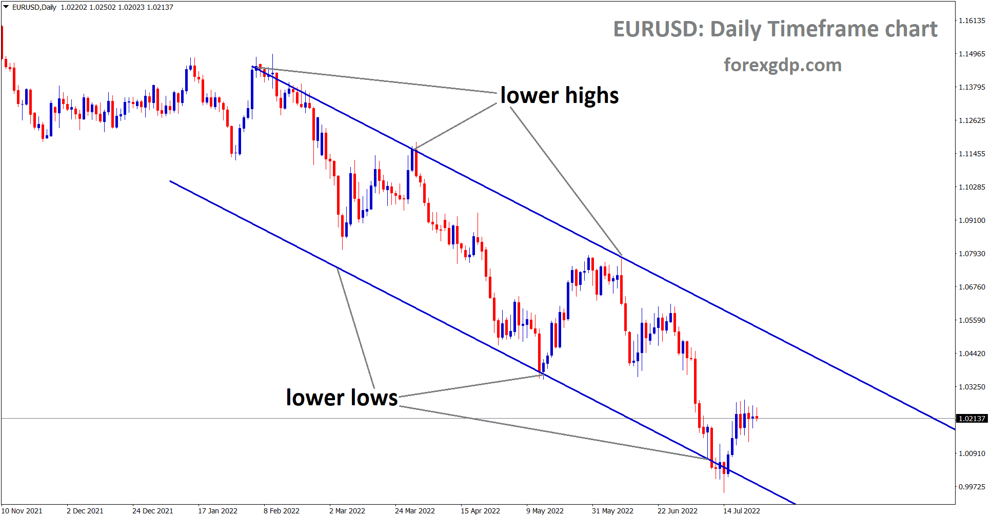
The Channel chart pattern is a continuation pattern that is generated by the intersection of two lines. This pattern has a name that refers to its shape, which is a channel. These two lines are written on the price chart in a manner that resembles a channel since they are parallel to each other and run in the same direction. The resistance line of the channel is the line that is located at the top of the channel, while the support line is located toward the bottom of the channel.
When a channel is moving in an upward direction by forming higher highs and higher lows, this type of channel is known as the bullish channel or Ascending channel.

On the other hand, when a channel is moving in a downward direction by forming lower highs and lower lows, this type of channel is known as the bearish channel or descending channel.

Here are the different types of forex trendline and channel patterns:
Head And Shoulders Pattern
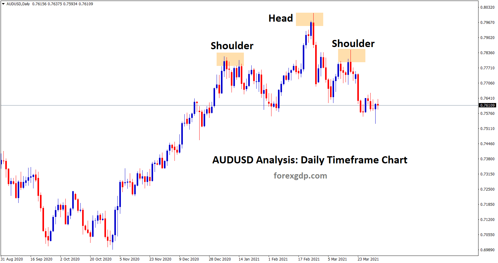
A chart pattern known as the head and shoulders appears when a high peak is accompanied by two slightly smaller peaks on either side of it. Head and shoulders patterns are studied by traders in order to forecast a bullish-to-bearish reversal in the market.

Inverse head and shoulder is just opposite to the regular head and shoulder

In most cases, the first and third peaks will be somewhat lower in height compared to the second peak, but they will all retrace their steps to the same level of support, often known as the “neckline.” It is expected that it will break out into a bearish downtrend once the third peak has dropped back to the level of support and established a new support there.
Double Top Pattern

Traders often take advantage of a pattern known as a double top to call attention to reversals in trends. The price of an asset will often reach its highest point before retracing its steps to a level that provides support. After that, it will make another ascent, and then it will turn back more permanently against the trend that is currently in effect.
Double Bottom Pattern
The formation of a double bottom on a chart is indicative of an extended period of selling activity that has caused the price of an asset to fall below a level of support. Next, it will climb to a point of resistance before beginning a new downward trend.

As the market continues to show signs of bullishness, the trend will eventually turn around and begin an upward movement. The formation of a double bottom is considered a bullish reversal pattern because it indicates that a downward trend has come to an end and that an upward trend is about to begin.
Cup And Handle Pattern
The cup and handle pattern is a positive continuation pattern that is used to depict a period of bearish market sentiment before the overall trend eventually continues in a bullish motion. This unfavorable market sentiment comes before the global pattern finally continues in a positive motion.

The design for the cup looks a lot like a rounding bottom chart pattern, while the pattern for the handle looks a lot like a wedge pattern. After the rounding bottom, the price of an asset will most likely enter a transitory retracement that is known as the handle. This retracement gets its name from the fact that it is restricted to two parallel lines on the price graph. The price of the item will finally break above the handle, which will signal a continuation of the positive trend as a whole.
Rounding Bottom Pattern

A chart pattern known as a rounding bottom can either indicate a continuation or a reversal. For instance, the price of an asset may have a momentary retracement during an upward trend before resuming its ascent.
This would be a continuation of the positive trend. The formation of a rounding bottom just before a trend reversal into a bullish uptrend is an illustration of a bullish reversal rounding bottom. In this case, the price of an asset would have been moving in a negative trend when the bottom was created.
Wedges Pattern
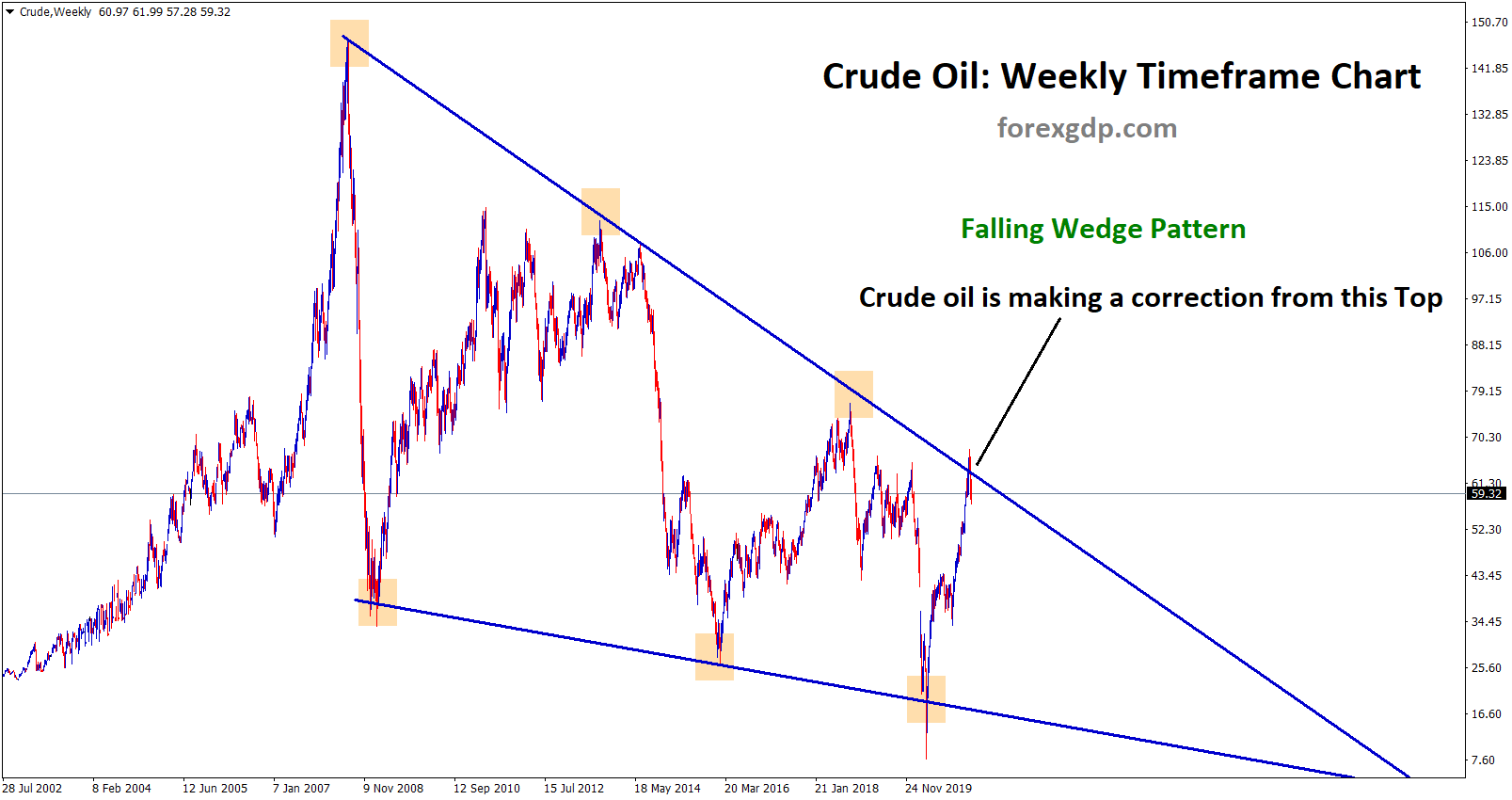
Wedges are formed when the price fluctuations of an asset become more constrained between two trend lines that slope downward. The rising wedge and the falling wedge are two distinct varieties of the wedge.

A trend line that is trapped between two lines of support and resistance that are sloping upwards can be used to illustrate a rising wedge pattern. In this particular instance, the slope of the line of support is greater than that of the line of resistance. When this pattern appears, it is usually a warning indication that the price of an item will eventually fall more permanently; this is proved when the price falls below the support level.

A falling wedge is formed when two levels with a decreasing slope meet in the middle. In this particular instance, the slope of the line of resistance is greater than that of the support. As the following illustration demonstrates, a falling wedge is often suggestive that the price of an asset will increase and break through the level of resistance in the near future. There are two types of reversal patterns: rising wedges and falling wedges. Rising wedges indicate a bearish market while falling wedges are more characteristic of a bullish market.
Ascending Triangle Pattern

One type of bullish continuation pattern is known as the ascending triangle, and it indicates that an upswing will likely continue. Charts may be used to make ascending triangles by first drawing a horizontal line along the swing highs, which represent the resistance, and then drawing an ascending trend line along the swing lows, which represent the support.
This creates the shape of an ascending triangle. It’s common for ascending triangles to have two or more peak highs that are exactly the same, which makes it possible to construct a horizontal line. The upward movement of the pattern as a whole is shown by the trend line, whilst the degree of resistance encountered in the past by that specific asset is depicted by the horizontal line.
Descending Triangle Pattern

On the other hand, a falling triangle indicates that a downward trend will continue in a negative direction. In order to make a profit from a falling market, a trader will often open a short position when the market is exhibiting characteristics of a descending triangle.
Because descending triangles are symptomatic of a market that is controlled by sellers, they often shift lower and break through the support. This indicates that successively lower peaks are likely to be widespread and unlikely to reverse course in the near future.
A horizontal line of support and an inclining line of resistance are the characteristics that distinguish descending triangles from other types of triangles. At some point in the future, the trend will resume its downward trajectory after breaking through the support.
Symmetrical Triangle Pattern

Depending on the state of the market, the symmetrical triangle formation can either have a bullish or a bearish implication. After the formation of the pattern, it is almost always a continuation pattern, which means that the market will typically continue moving in the same direction as the general trend. This is true regardless of the specific scenario.
When the price converges with a succession of lower peaks and higher troughs, symmetrical triangles may be seen forming in the chart. The next illustration demonstrates that there has been a small-time of upward reversals, but the main trend is bearish.
This is shown by the symmetrical triangle, which we can see below. On the other hand, if there is no apparent trend in the market before the formation of the triangular pattern, the market may break out in either direction. Because of this, symmetrical triangles are considered to be bidirectional patterns. This means that they are most effective when utilized in turbulent markets when there is no indication as to which direction the price of an item could move.
Pennant Pattern
Pennant patterns, sometimes known as flags, are formed when an asset goes through a stretch of ascending movement, which is then followed by a period of consolidation. In most cases, the beginning phases of a trend will be characterized by a big increase, which will be followed by a succession of minor moves, both in the upward and downward directions.

Pennants can be bullish or bearish, and they can signify either a continuation of the trend or a change in the direction of the trend. The chart that you just looked at is an illustration of a bullish continuation. In this sense, pennants may be seen as a type of bidirectional pattern since they can either depict continuations or reversals of previous patterns.
In spite of the fact that a pennant may appear to be comparable to a wedge pattern or a triangle pattern – both of which will be described in the next sections – it is essential to keep in mind that wedges are smaller than pennants or triangles. Another distinction that can be made between wedges and pennants is that wedges always point in an upward or downward direction, but pennants are always horizontal.
Check the major chart patterns with take profit examples here
